Error 2050: No Ice Found
Error 2050: No Ice Found is a design project aimed at visualizing the impact of carbon emissions on ice melt. The project uses relatable carbon emission data to illustrate the area of ice loss and spray paints these visuals on sidewalks to raise public awareness and encourage reducing carbon emissions.

Arctic Sea Ice is Rapidly Vanishing
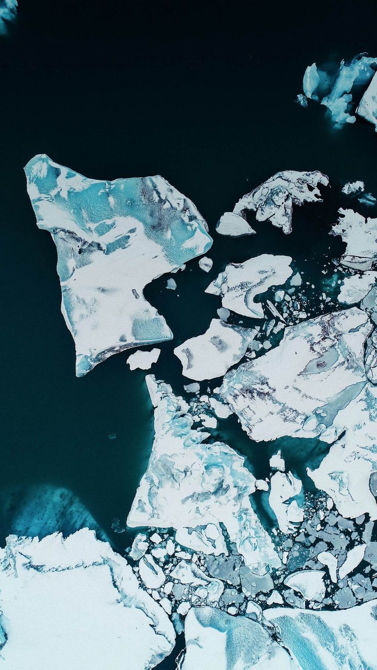
The Arctic sea ice is rapidly disappearing, and this trend has become increasingly evident over the past few decades as global temperatures have risen. It's not only that Arctic sea ice is disappearing, the oldest and thickest ice is also melting, making the Arctic ice cap increasingly vulnerable to rising temperatures in both the oceans and the atmosphere. A new analysis, using global climate models, predicts that most of the Arctic Ocean could become ice-free during summer by 2050.
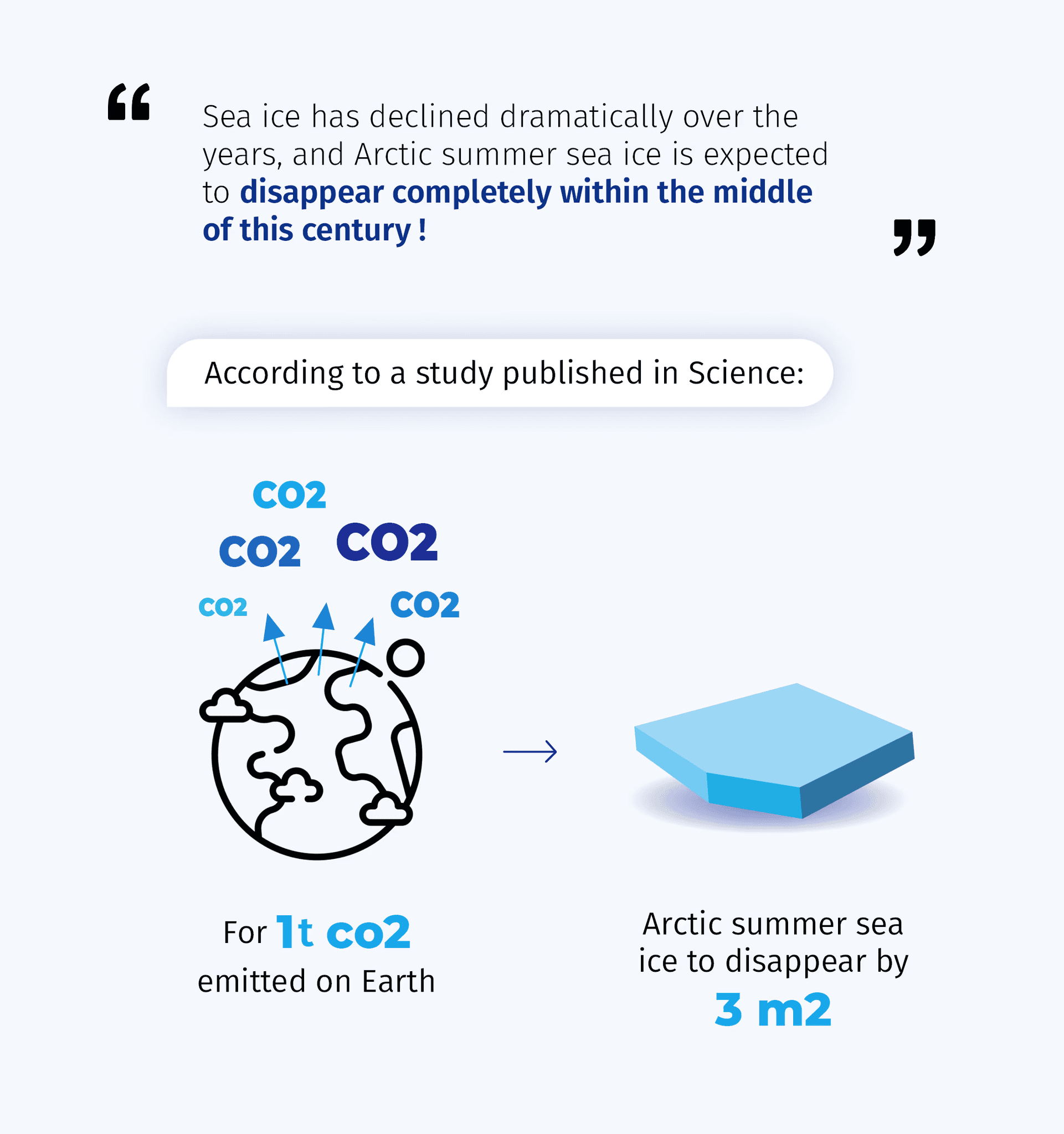

Dirk Notz, from the Max Planck Institute for Meteorology, Hamburg and Julienne Stroeve, from the National Snow and Ice Data Center and University College London, established a linear relationship between the September sea ice area and cumulative carbon dioxide emissions. They inferred that for every metric ton of CO2 emitted, the September sea ice area decreases by approximately 3 square meters. Based on this relationship, an additional 1,000 gigatons of CO2 emissions would result in the complete disappearance of Arctic sea ice in September.
Daily Life & Arctic Sea Ice
Our daily carbon emissions significantly accelerate the melting of sea ice and drive climate change. Long-distance travel, in particular, greatly increases our carbon footprint due to higher fuel consumption. Whether by flying, driving long distances, or other forms of transportation, the large amounts of CO2 emitted during these activities are speeding up the disappearance of Arctic sea ice. Moreover, the average carbon emissions of Germany, the EU, China, and the world all far exceed the ideal per capita emission target of 2 tons per year.

Graphical Presentation of Data
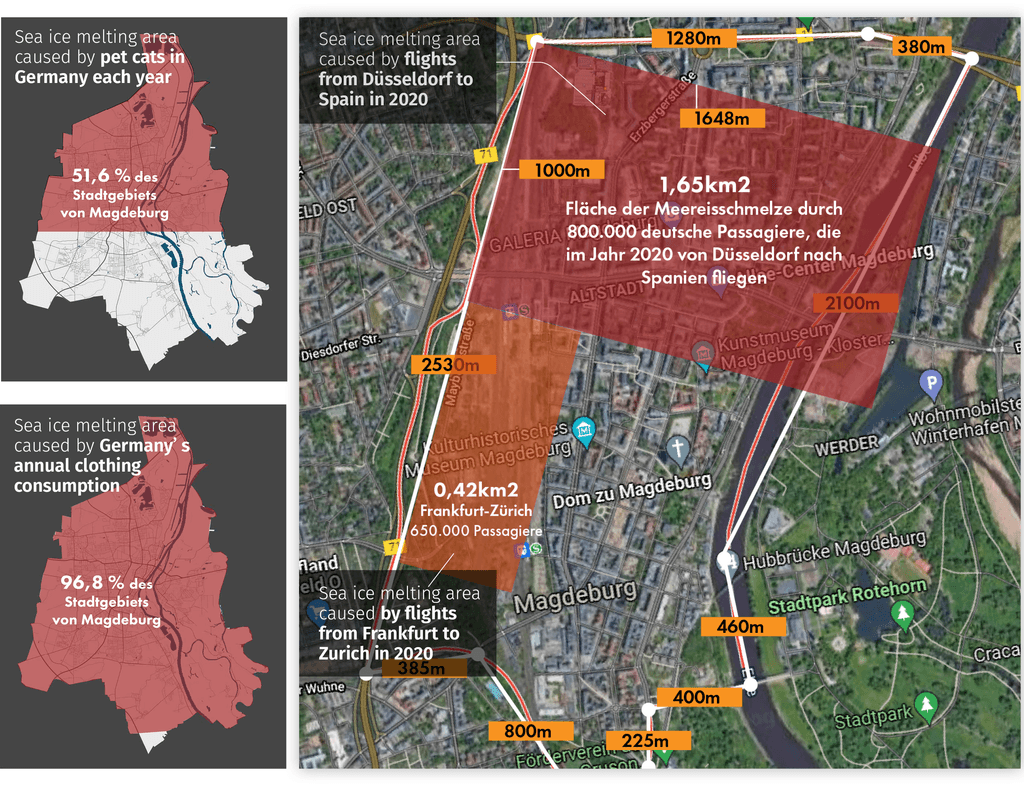
How can more people be made aware of sea ice melting in a more direct way?
First, I displayed some sea ice melting data on a map to scale. This helped to understand the extent of ice melt and achieve a more effective display.
Current Challenges
Small data points are almost impossible to represent to scale on a map (e.g., 40 m²)
Ongoing Training for Healthcare Professionals
Ongoing Training for Healthcare Professionals
Final Concept
1:1 Scale Visualization
By representing per capita data at a 1:1 scale on the streets, pedestrians can get a better visual impression of the data's magnitude.
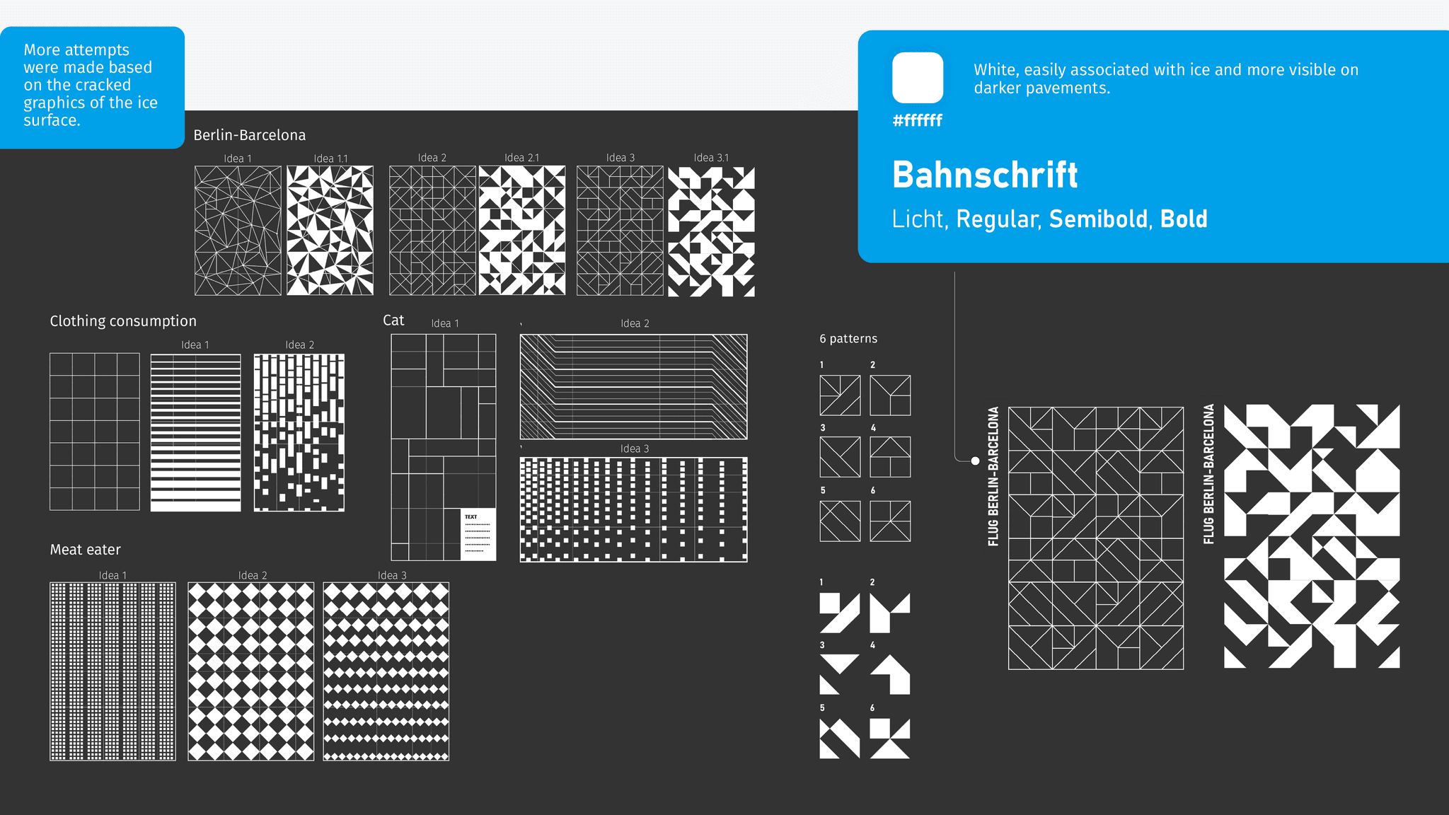
Ice Graphics
These data points are displayed using ice-like graphics.
Design Process
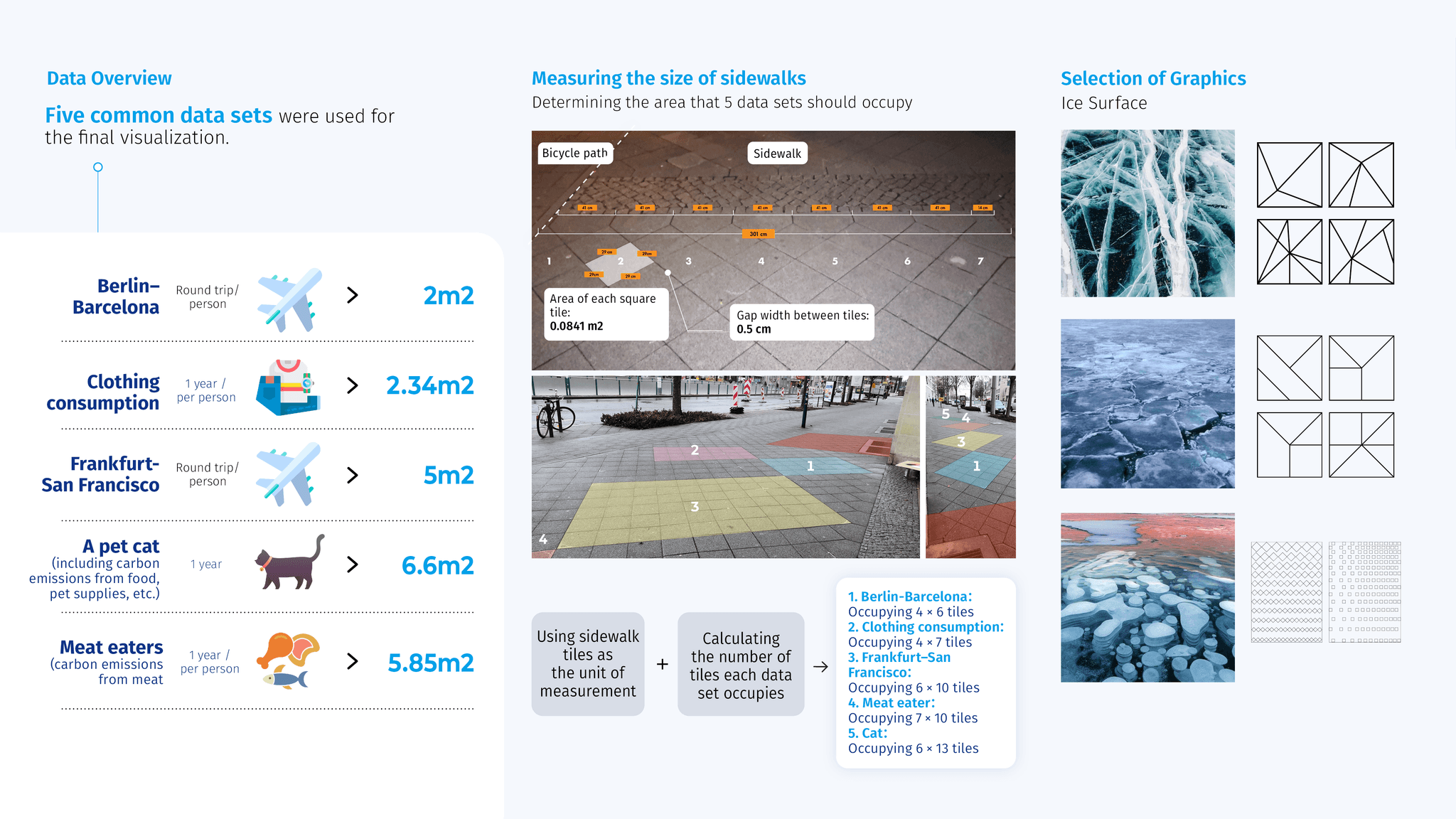
The target audience includes those who are both outbound travelers and users of digital services. This group primarily consists of people aged 25-35, mainly from first- and second-tier cities, who are accustomed to using various online travel platforms.1234566788888
Creating and Selecting Graphic Styles
Spray Painting Process
I applied the five data sets, sized accordingly, onto the sidewalk using eco-friendly chalk spray paint. This method visually represents the data on the pavement, ensuring both clarity and environmental responsibility.

During the spray painting process, it drew a lot of attention from passersby, with many raising questions. After learning about the project's concept, some expressed their shock and reflected on their own carbon emissions.
Passerby A:
"I have a pet cat, and I didn’t realize that having a cat could contribute so much to sea ice melting. I might need to take some actions to reduce my carbon emissions."
Passerby B:
"To be honest, I’m usually quite frugal and rarely take long trips. But my grandchildren definitely have much higher carbon emissions."
Final Visualization
As pedestrians pass by and rain falls, the chalk spray paint gradually dissolves—just like our sea ice.


